

Oct - Nov /2021
Discovery, Ideation, High-Fidelity Design, Prototyping, Testing
• Promising launch
• Outstanding usability test results
Collaborated with the client and balanced expectations with feasibility and user-centricity.
Innovated in the events applications industry through coming up with a concept different and perhaps more valuable than any of the other applications.
Made the client quite happy through delivering a well-thought application that aimed at solving an interesting problem.


Yet, it seemed as if many people still had no knowledge about events happening around their area. Events that they would, on a later date, say:

Once we realised this, we wondered if there was any way to showcase events to people, but go
further than that. We wanted to make it different.
From the get-go, we wondered how we could make people more willing to go to events not solely
based on the event itself, but also based on who is going to this event.However, the finished
product was very different than what we were expecting.
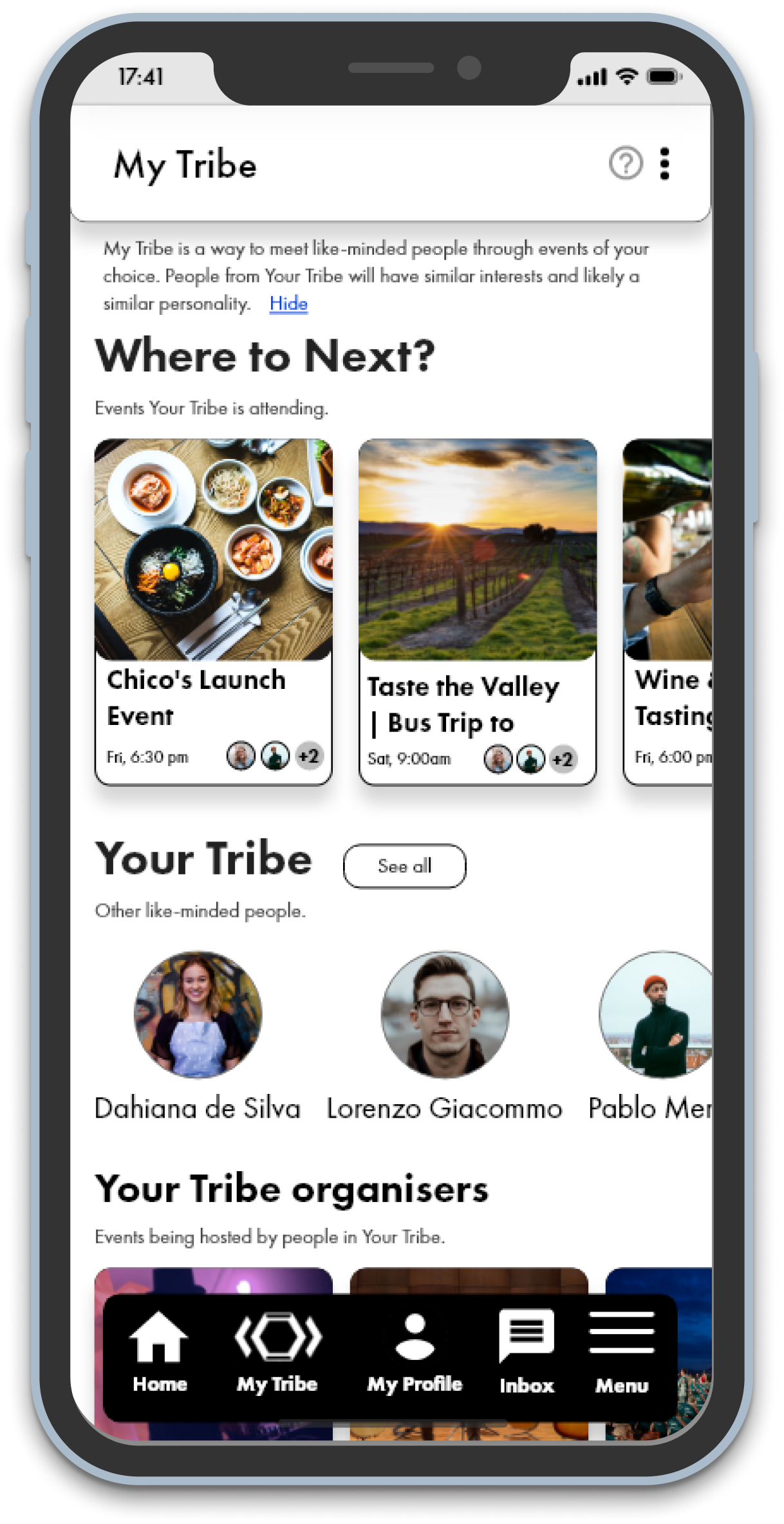
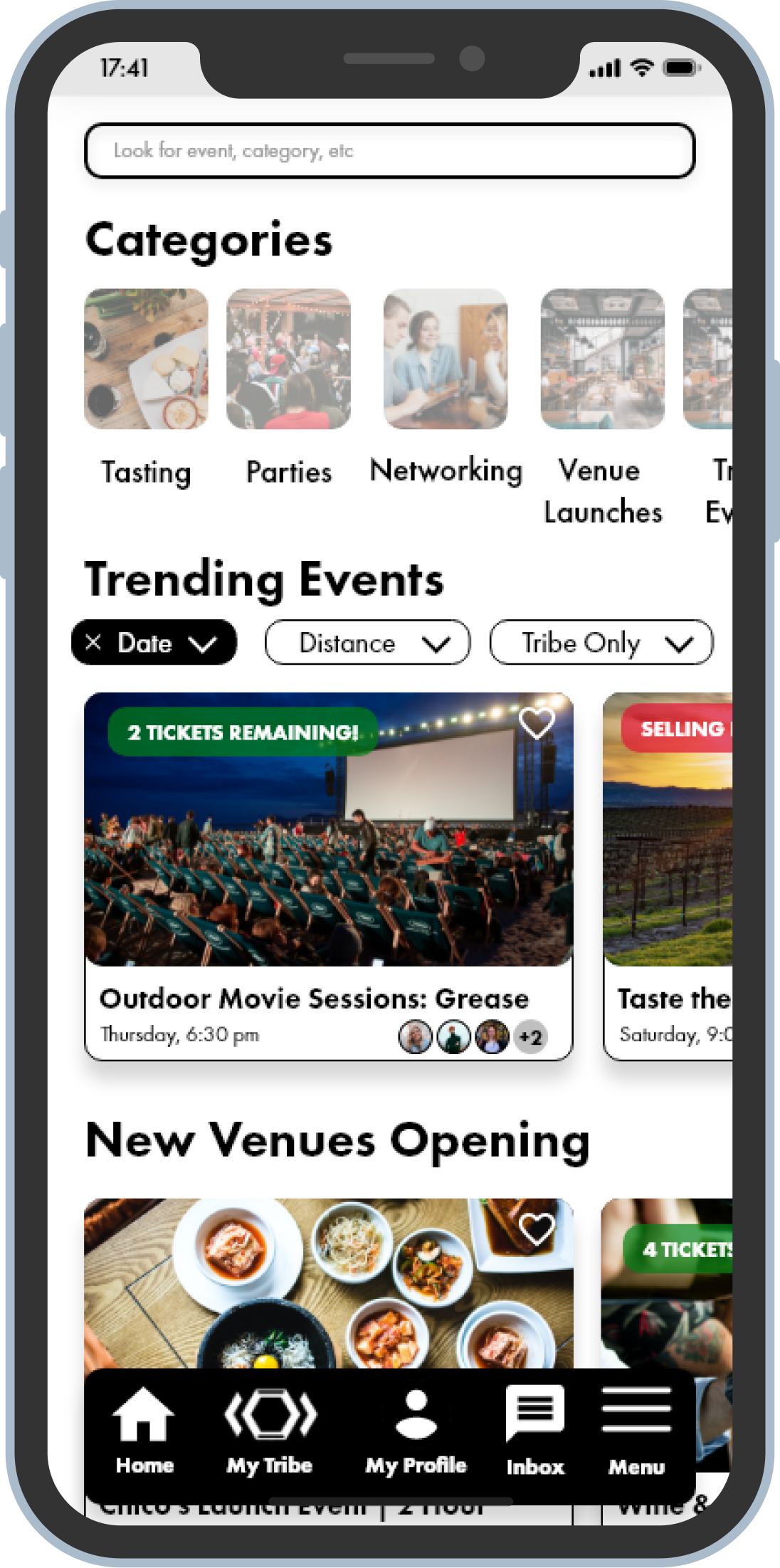
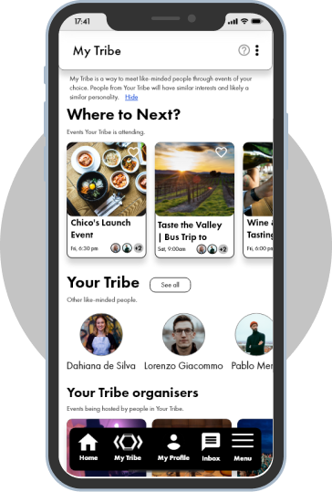
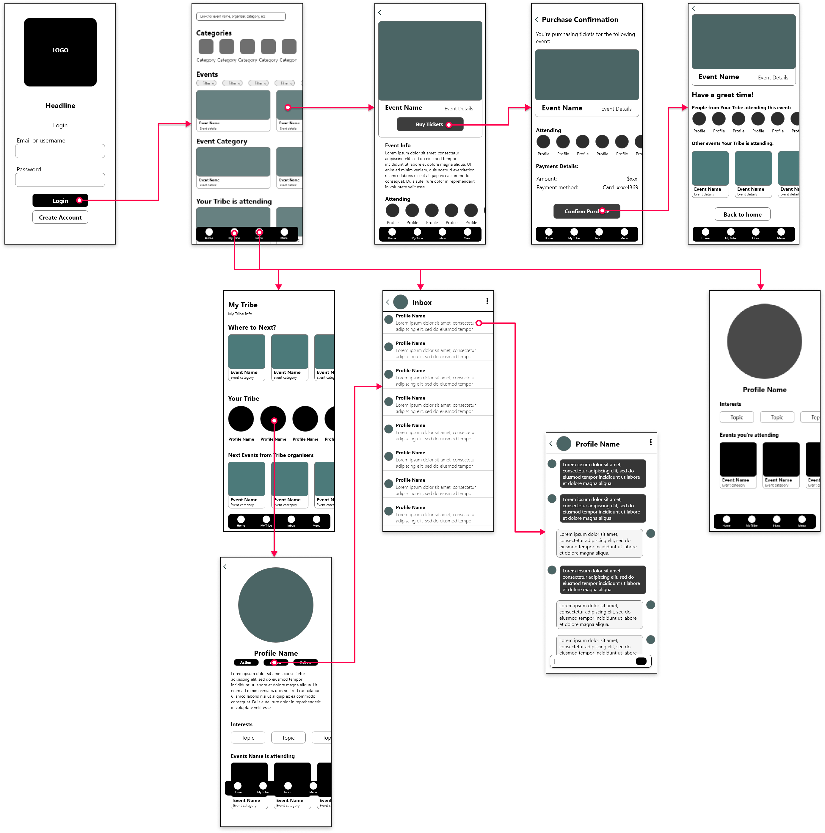
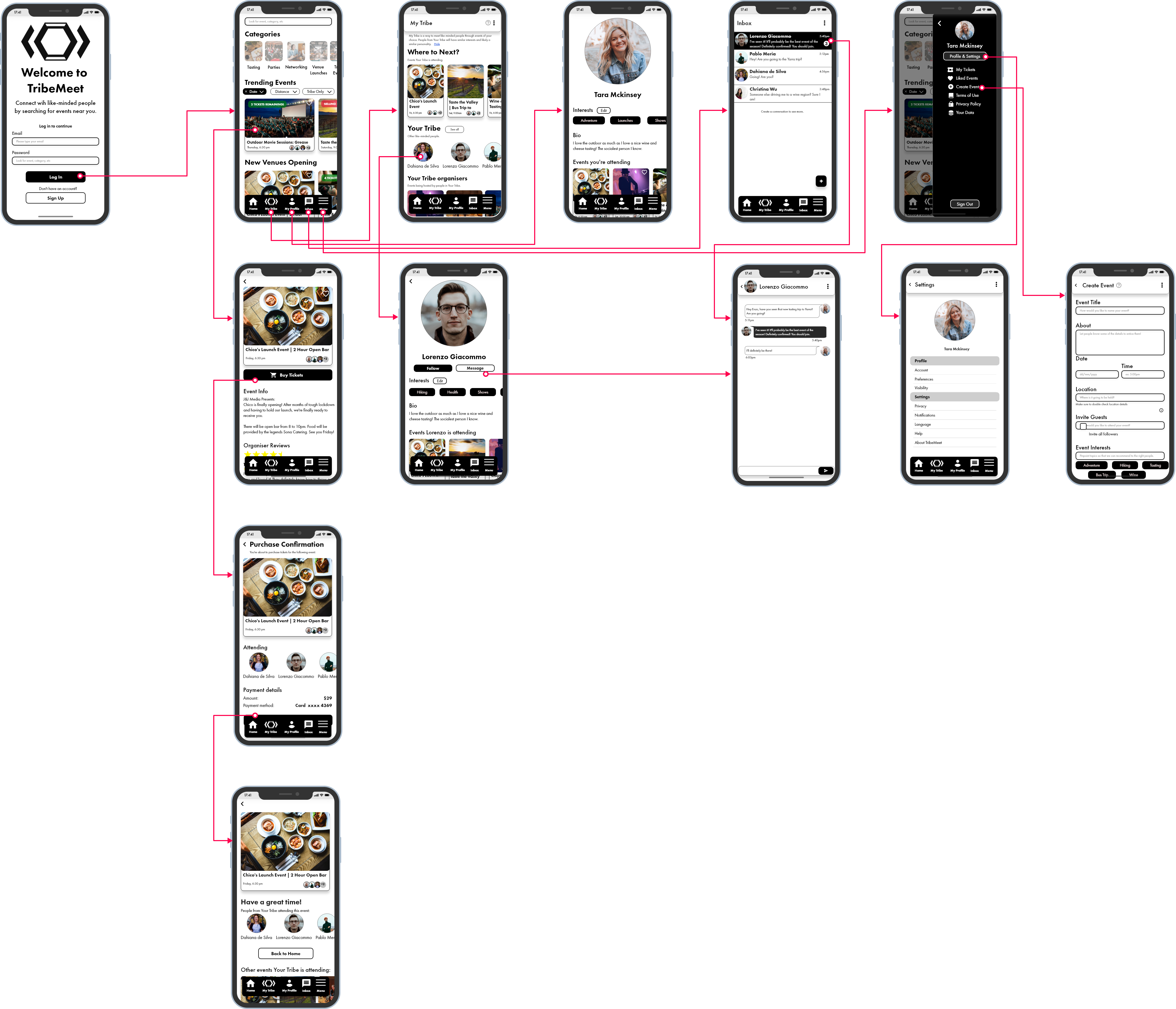
TribeMeet allows users to not only discover great events, but also look for the ones where they are more likely to meet other similar-minded atendees.
TribeMeet allows users to not only discover great events, but also look for the ones where they are more likely to meet other similar-minded atendees.
Millennials meet many of their friends and acquaintances either through other friends or online
in today’s world.
Gone are the days where you talk to a stranger in the street and become friends (has that ever
even existed?).
We had reasons to believe people would like to not get to know about events around them, but
events where like-minded people would attend. But how could we validate that?
These were our assumptions to why that was a problem worth solving:
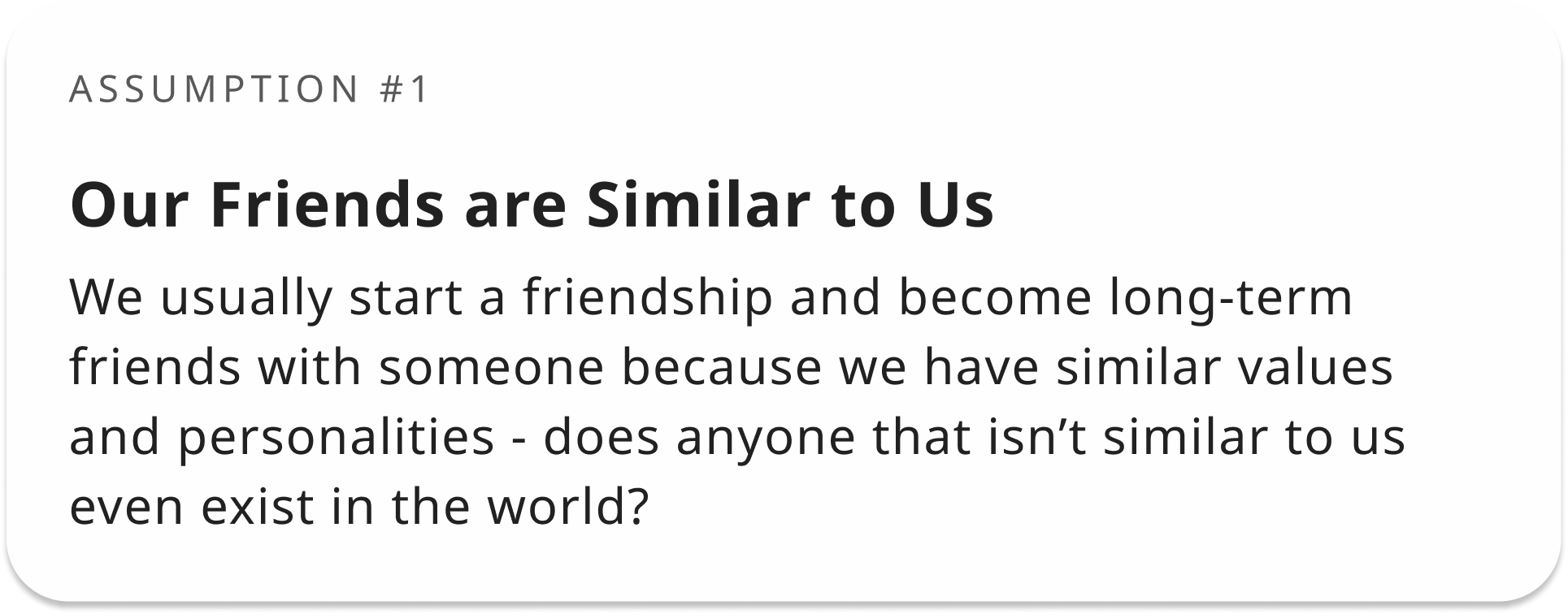
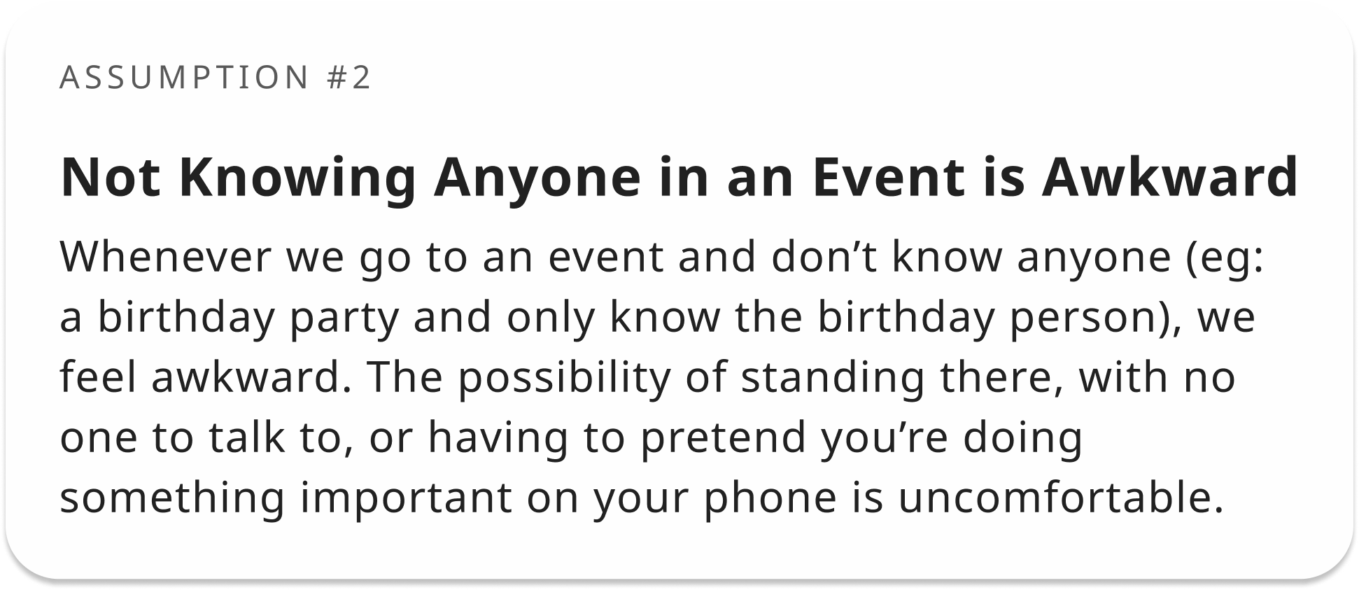
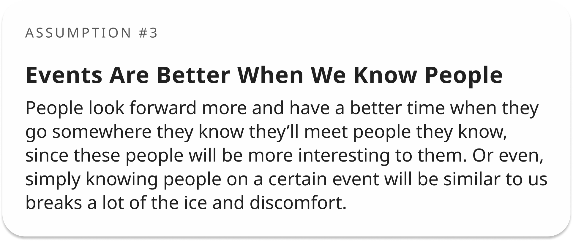
This line of thought would definitely give us some ground to validate the idea that people would like to meet people through going to events they’d be interested in.
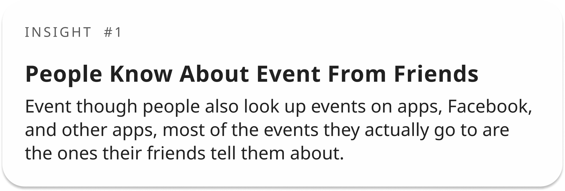
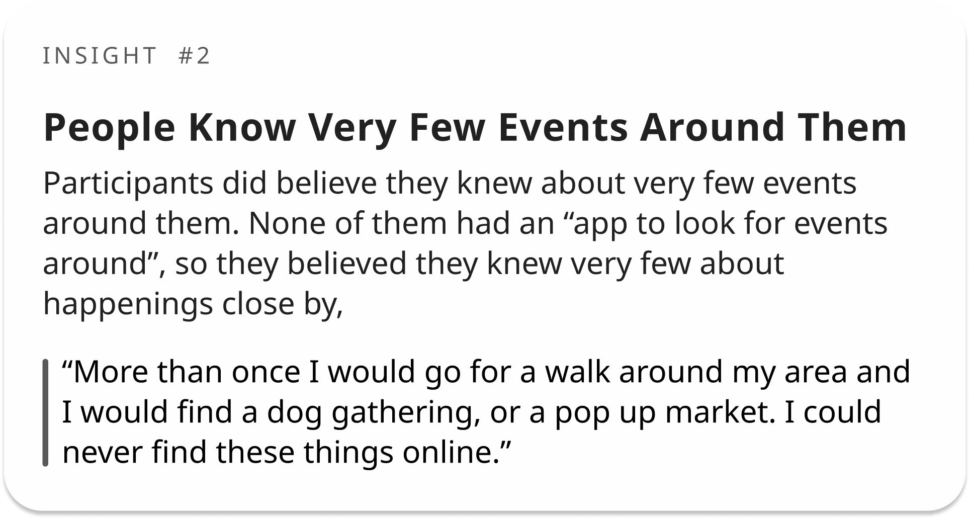
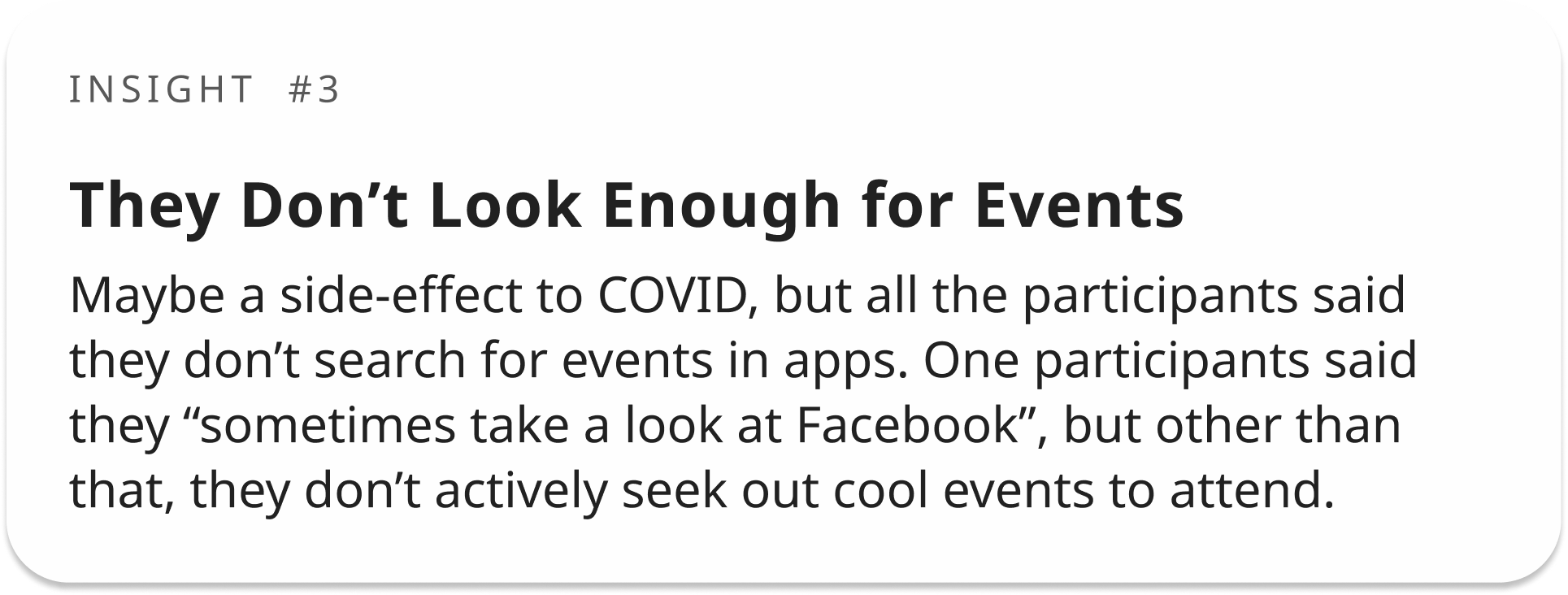
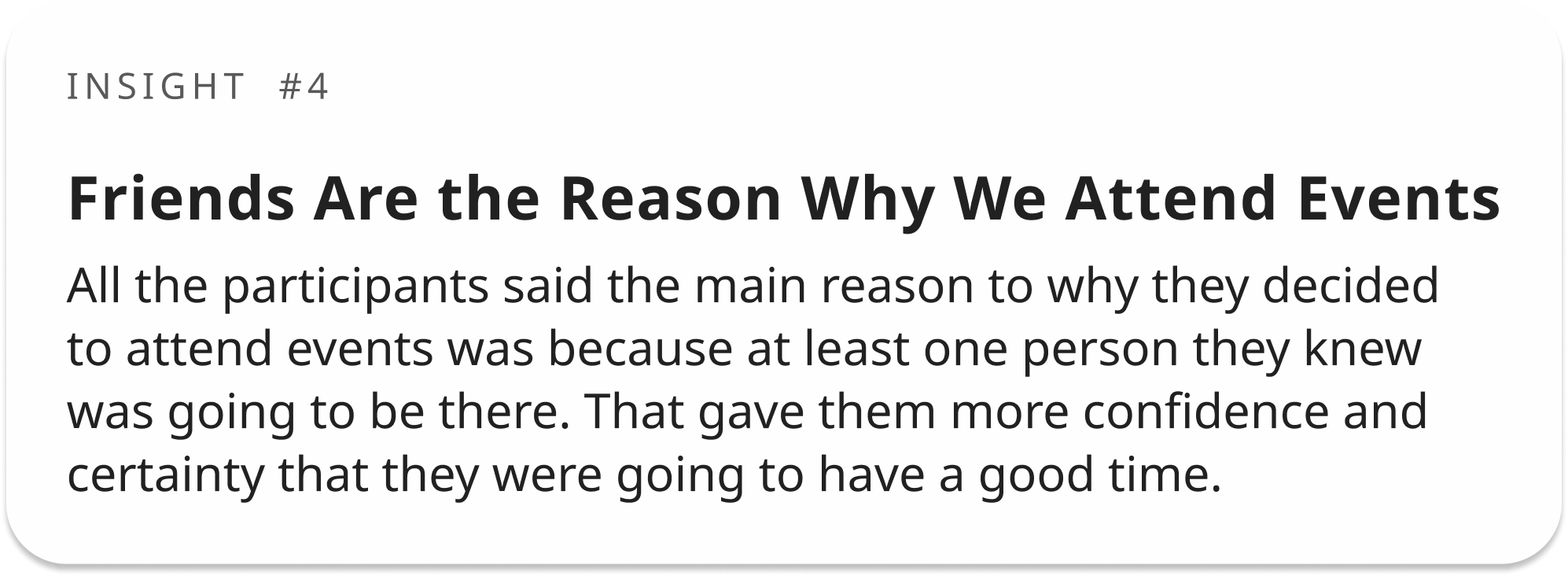
With the competitive audit, we realised at a much higher degree how much we should be promoting the ‘meeting people’ feature - much more than in the beginning, when the idea was to simply show people events around them and show them other users attending that could be ‘of their interest’.
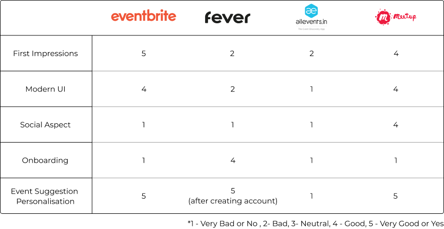
Due to other apps (such as Meetup) not making this feature of meeting new, similar minded people, a main part of their app, it then became a priority for us to build an app not where people find events around them and maybe meet similar folks.


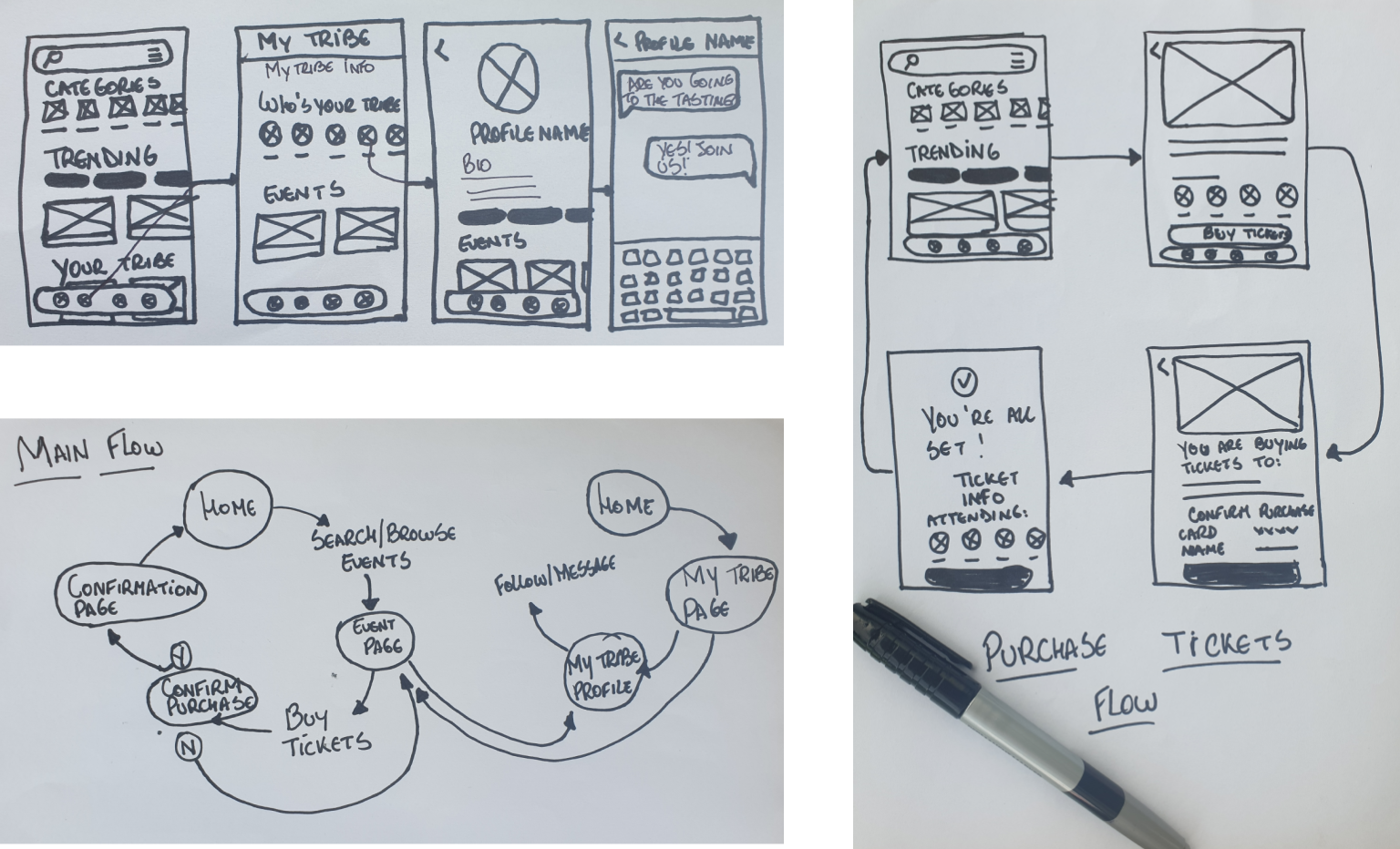
After doing some Crazy Eights and some other quickdribbles, I was finally able to better understand how I wanted to set up the flows and how the experience was going to be designed. It was interesting to try many different types of layouts and, even in P&P sketches, they can change the experience and how the information is set up in the page.
None of the 5 participants we interviewed had big issues with
regards to usability.
The only good insight was that 3 out of 5 participants gave 3 out of 5 points for the sentence
“The writing was clear”, once asked about it, they just raised to us small copy sections in
which they got confused, not enough to have any flow impact, however.
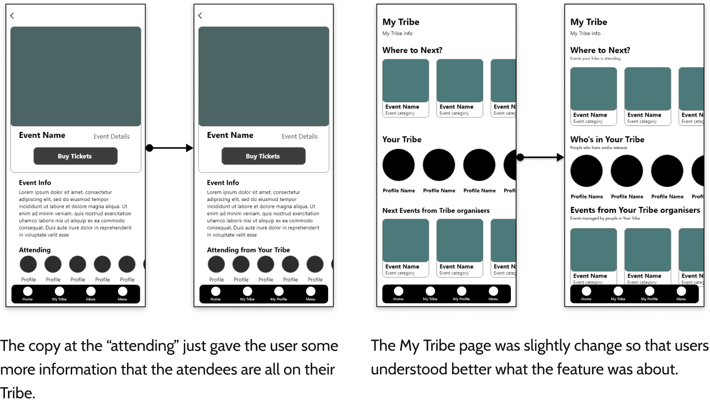
The following changes were made:
Even though it ended up being decided the app wasn't going to ship, I’ve handed the prototype to
some friends who would be the target audience for the app - 3 people. They all absolutely loved
the idea and the overall experience.
I shouldn’t really trust feedback from friends, since they want to see you happy, not sad when
they say “I wouldn’t use this.” However, I was looking at their reactions when they were handed
the prototype (I wanted them to experience it in a mobile phone), and they seemed very real.
In the end, everything a designer wants is when users look at their design with a look of “Aha!
Where have you been this whole time?”, right?
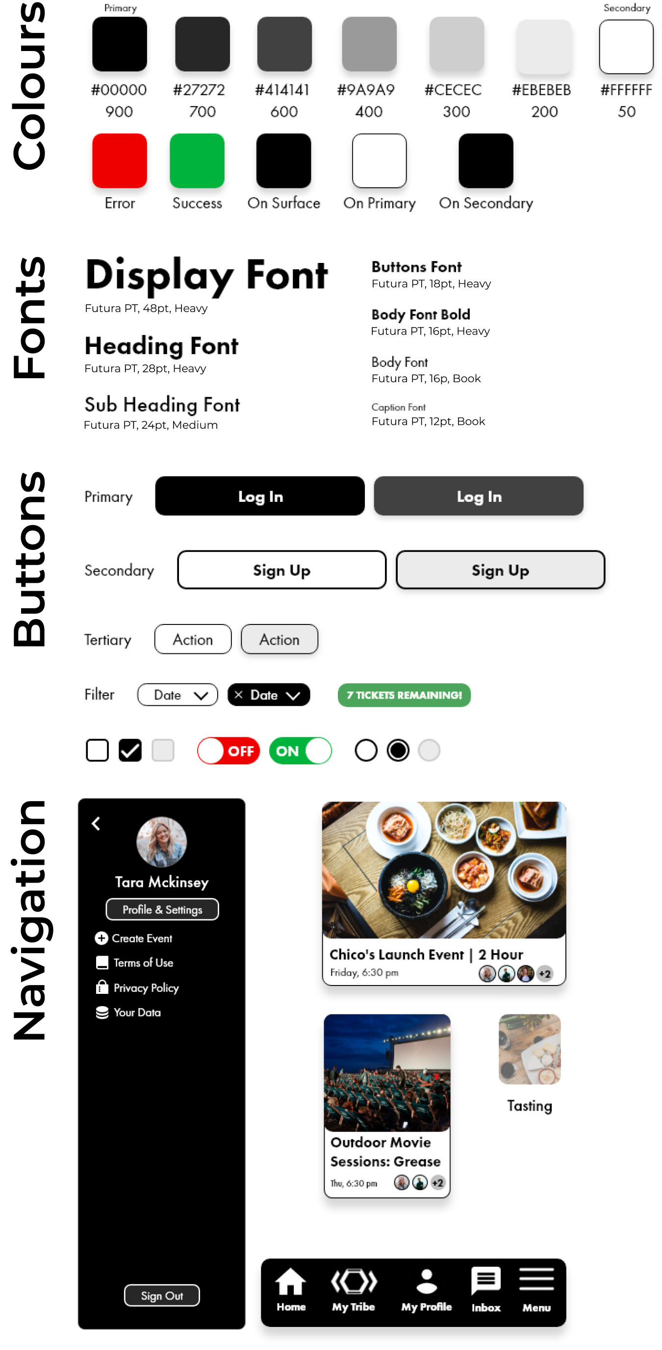
Even when a design doesn’t seem to be coming out the exact way we want it to be, it is better to
just finish it, judge it, and then iterate on it.
Wasting time trying to fix something in the “old” design sometimes may seem like the
common-sense approach because we don’t want to deliver something ugly (which we don’t), however,
sometimes finishing and redoing it with a fresh mind increases the optimization by 10x.
After having designed both with a mobile approach in mind, as well as a desktop-focused program,
mobile-first seems to allow a designer to really understand and prioritise what is really
important in a page and build from there.
Starting from a desktop approach (referring to my inexperienced way of doing it) might make a
design messy and not entirely focused on the user goals as much as the other.
Nailing down your research and having a great understanding of the problem-space is more than
key: it is the biggest difference-maker in any project.
Most products fail because they don't have a deep understanding of what they're actually trying
to solve for their customers, not because they're not being consistent with their iconography.
It is important to also understand why event organisers would want to utilise TribeMeet to market
their events and how they'd do it.
I'd do another round of interviews with this other party of the app and better understand how
they work and market their events.
Since the app's USP is about connecting similar people, my next step will be finding the best way to categorise people from the moment they open the app. That could be with an onboarding experience interest research, for example.