

May - Jun /2021
Concept to Prototyping
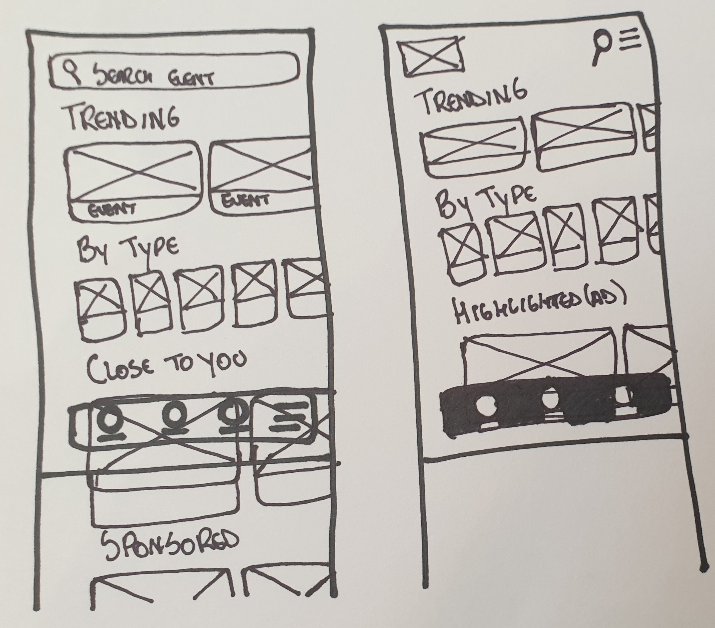
• Redesigned application based on UX Principles
• Metrics that would have been measured: Tickets Bought Over the Last 30 Days, Ads CTR, Monthly Active Users
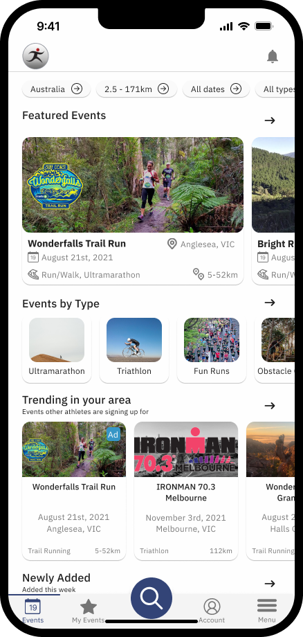
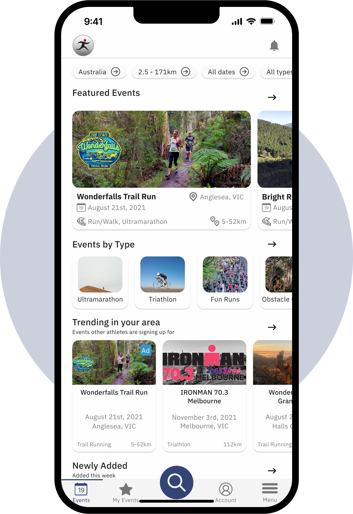
Redesigned Running Calendar based on important User Experience Principles that aimed to increase the overall app experience and metrics.
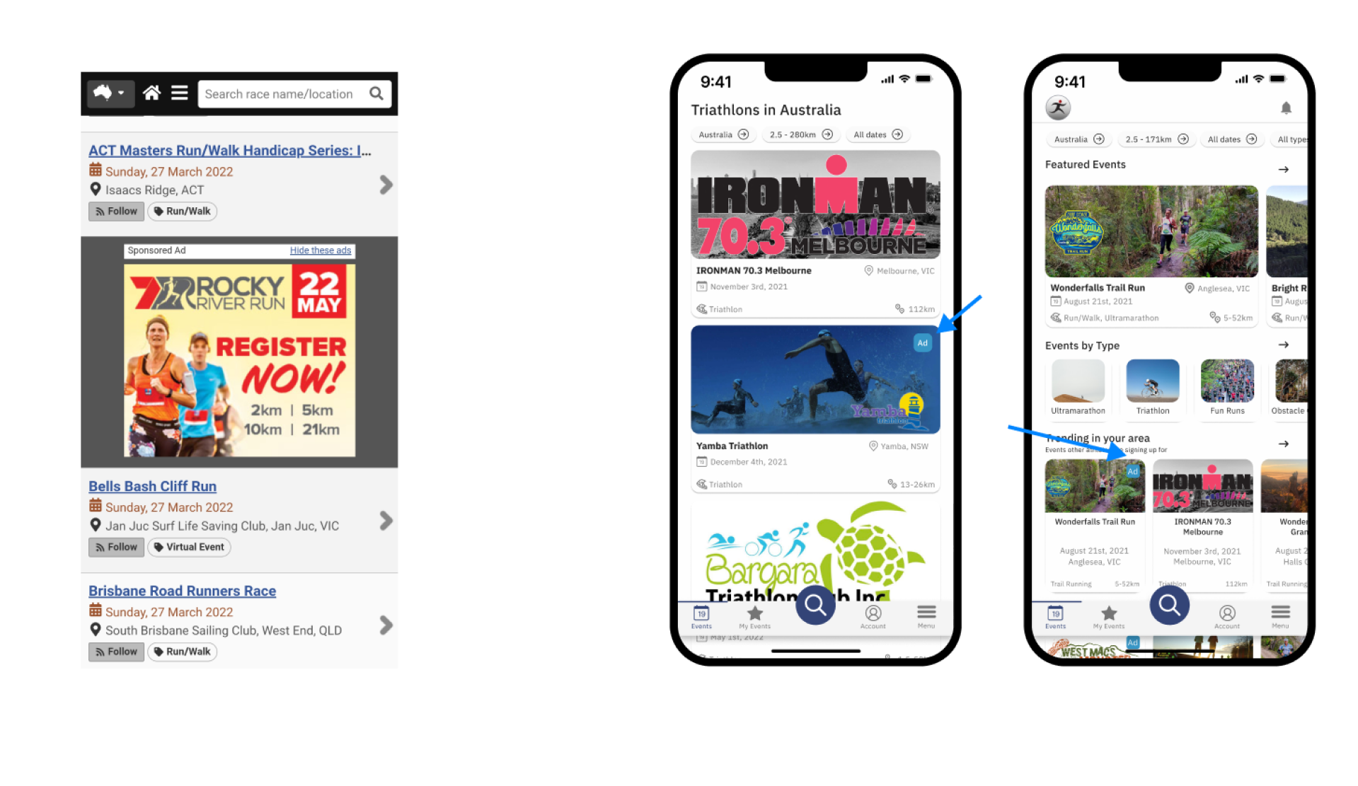
Ideated a smoother way to show ads, increasing the number of ads seen and potentially their CTR.
runningcalendar.com.au is the
to-go website for runners, triathletes, and other sport
enthusiasts to find events to participate around the country.
The only problem is: the website’s has very poor User
Experience/Interface.
Therefore, with no data available, I have redesigned the website simply utilising design
principles and having an understanding of how information on a website should be structured. By
being a long-time user of the website, having gone through certain frustration when browsing
events has also helped me tremendously.
It hurts me saying it, but one of my most loved websites truly
delivers a poor User Experience.
Usefulness is there, but not a not of usability or desirability.
These glitches, even though can be dealt with since Running Calendar is the main race aggregator
in Australia, contribute for a poor Experience and a weaker competitive advantage. Had the
website focused more on their product, they could have an even bigger competitive advantage.
A more intuitive IA leads to a better, easier, more intuitive experience.
Facilitating user’s visualisation of events is likely to get them to sign up to more events.
Other website’s main flow is very simple: get people to browse events so that they can find one
that they’d like to go - other flows are also important, such as get more organisers to
advertise their events and convince users to pay for a premium subscription.
Regardless, the two latter ones are only effective is the former is great. Less advertisers will
be willing to pay for exposure, as well as less users will be willing to pay for the premium
version if the main flow (browsing events) isn’t as optimal as it can be.
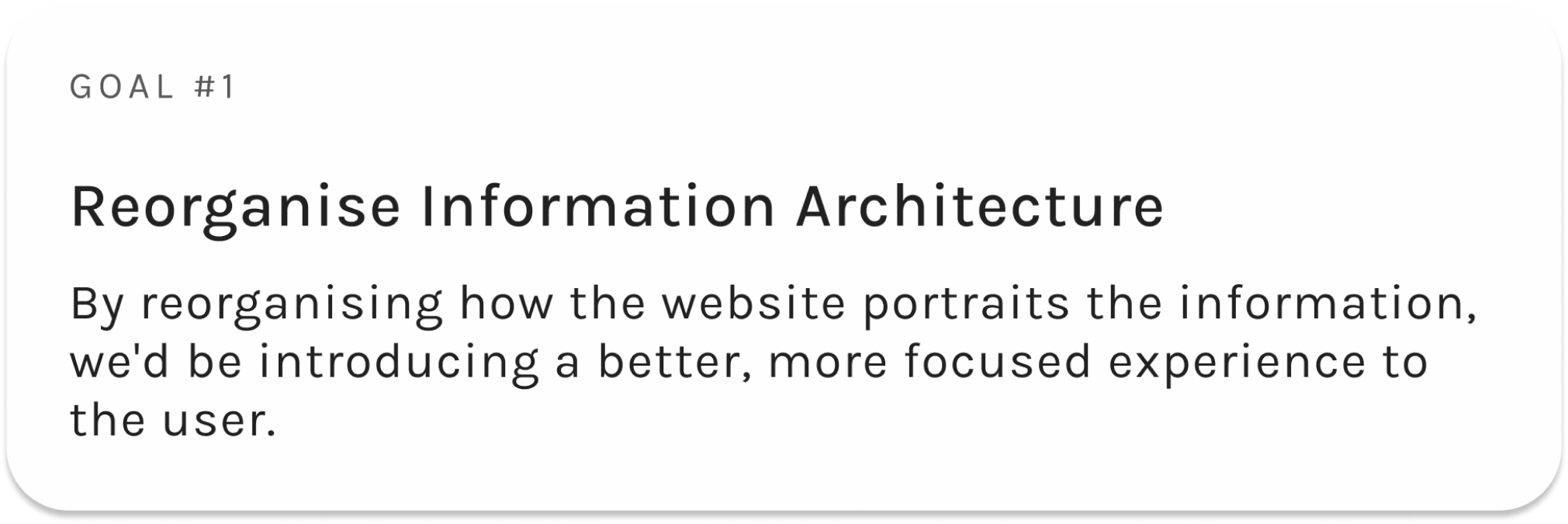
Having said that, the poorly designed Information Architecture does not allow for a good
experience when browsing events.

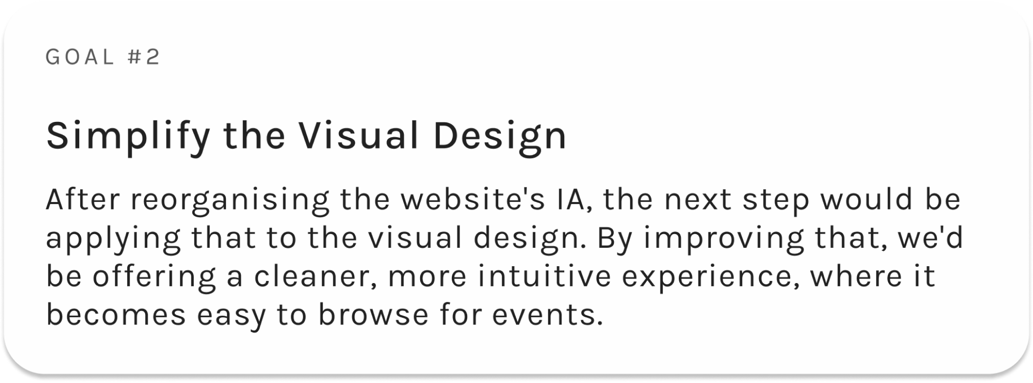
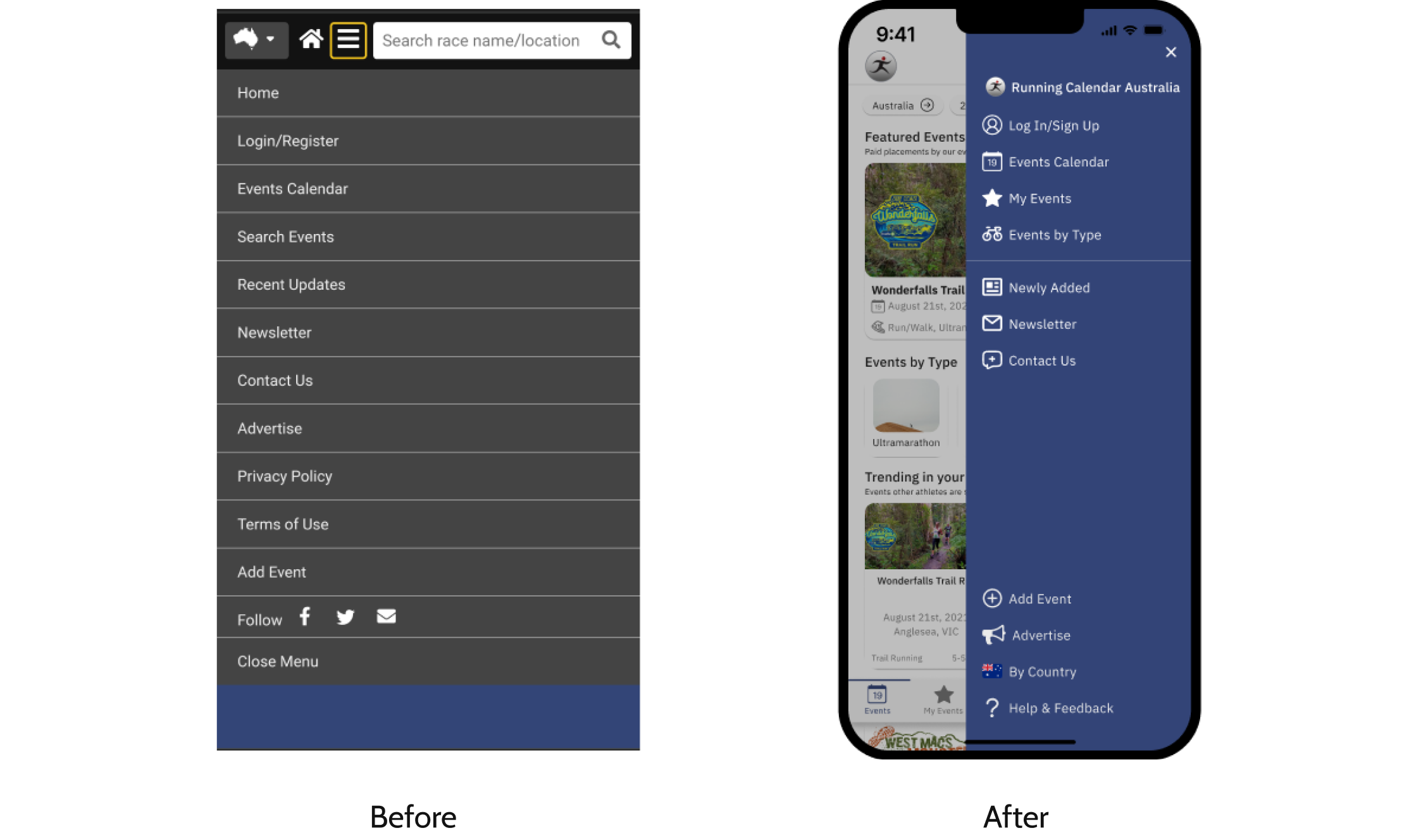
Because of the poor IA and Visual Design, the design became extremely polluted, causing too much cognitive load to the user. Unimportant links showing in the sidebar, and so on.

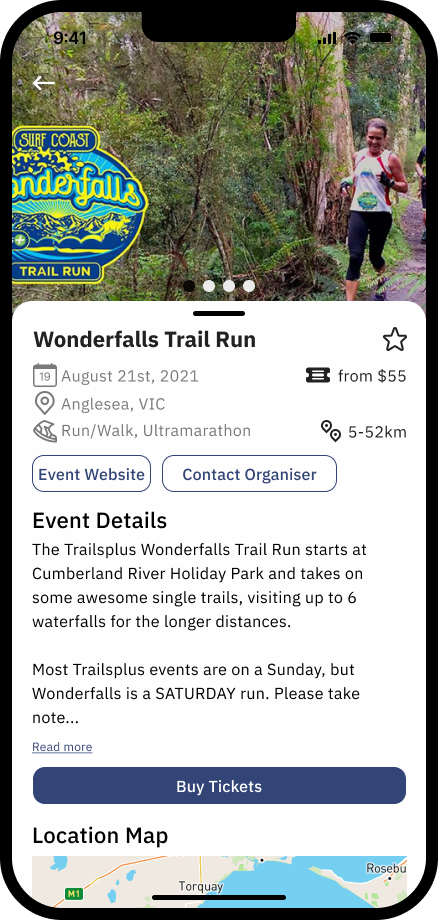
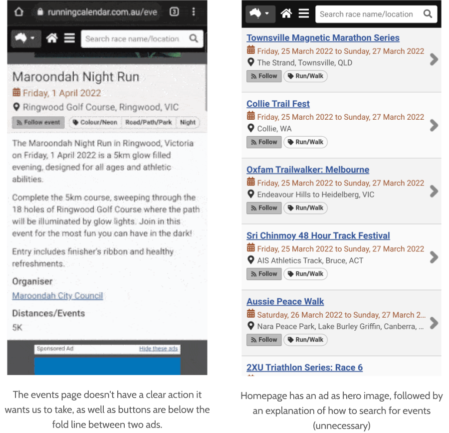
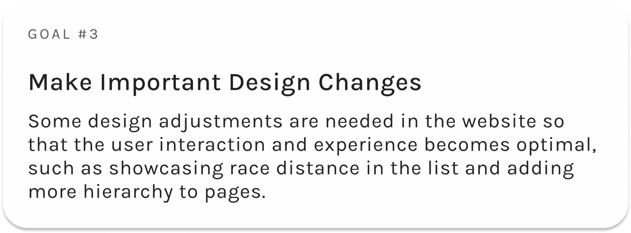
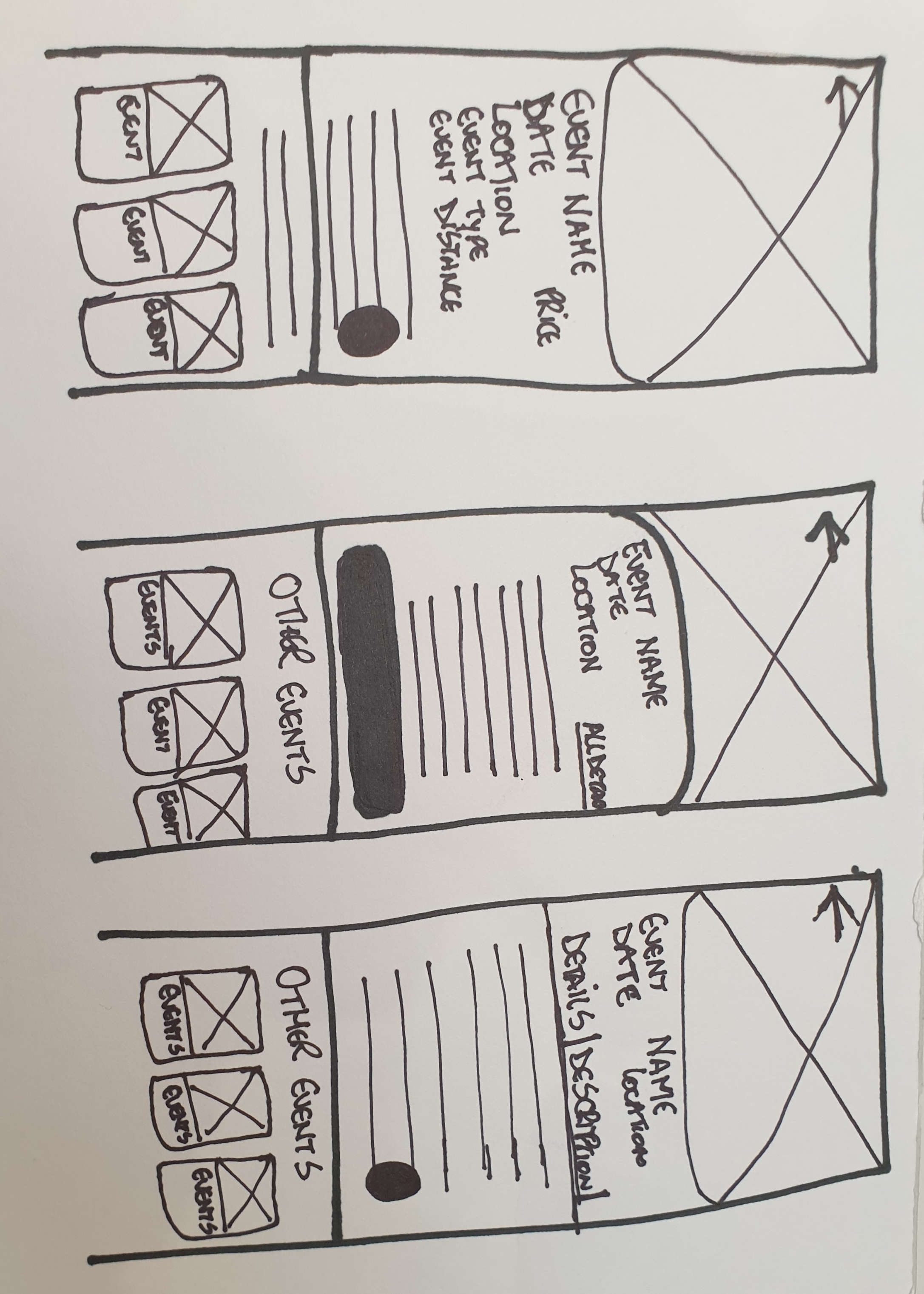
Event cards don’t show an extremely important piece of information: distance. Also, event pages don’t have clear hierarchy or desired action for the user to perform.
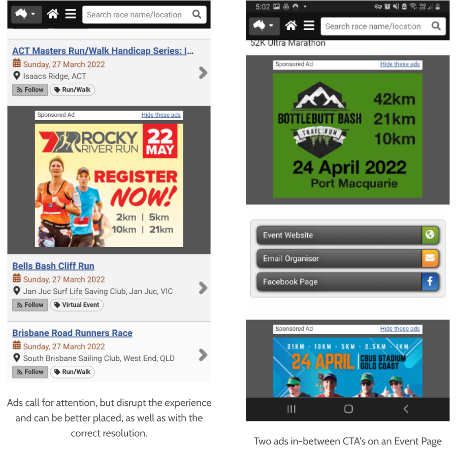
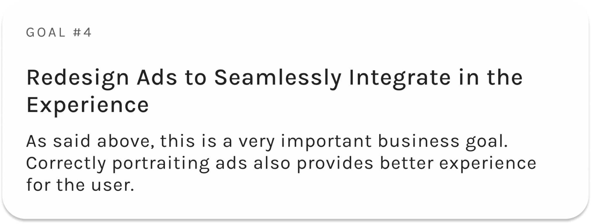
There isn’t a correct way to portrait ads. However, the biggest AdTechs all blend their ads with
the rest of the experience (ex: on Instagram, ads are just photo cards, and Google Ads on search
are shown as if they were links to a search the user just made).
I do think that, by blending ads with the rest of the navigation components we would enable the
user to have a better experience.
• Tickets Bought Over the Last 30 Days
• An increase in tickets bought translates into higher revenue and users going to races
• Ads CTR
• An increase would mean users are getting more value from the ads
• Monthly Active User
• An increase in MAU might mean users are getting more value out of the platform

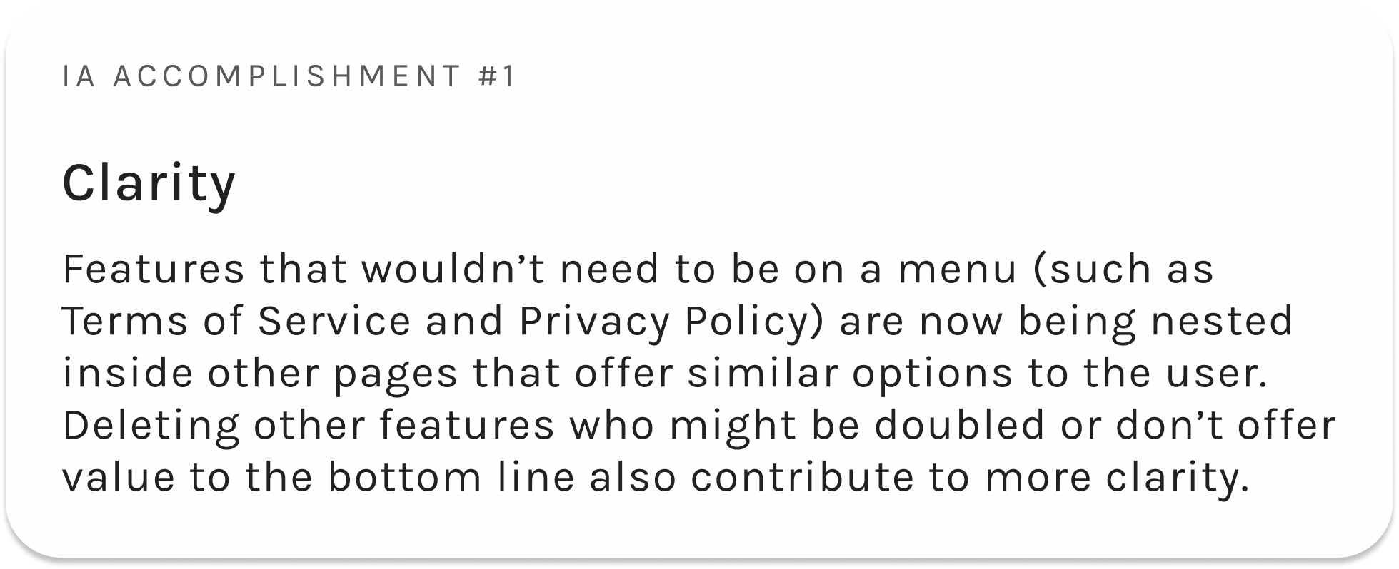
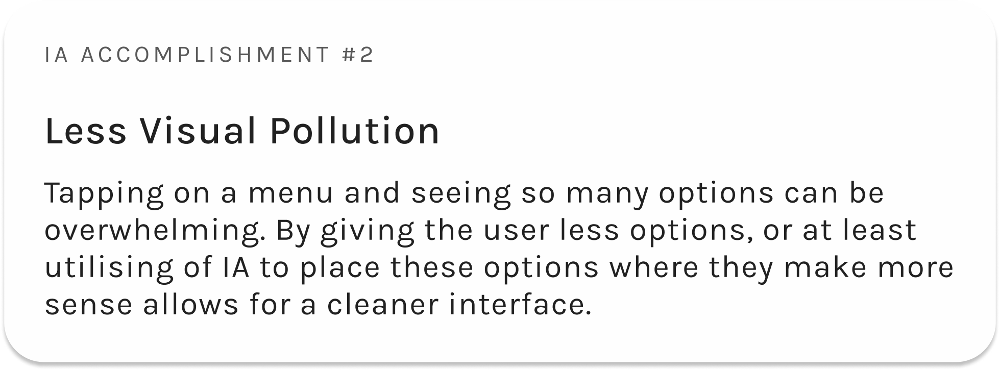
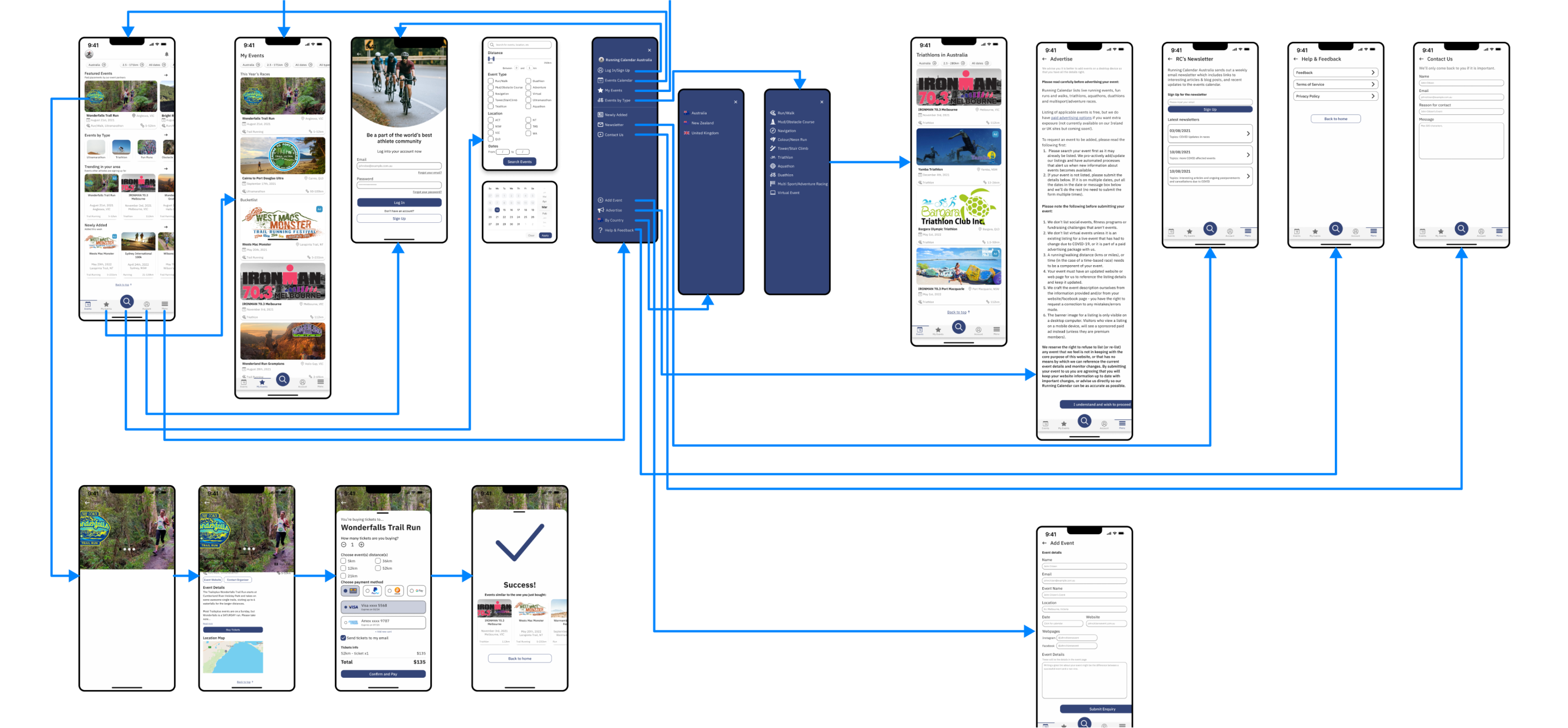
With this revised Information Architecture, we accomplish a few important design goals:
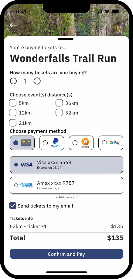
Other important changes such as replacing the home page’s ‘hero banner ad’ and explanation of how to search for events in the home page, as well as changing CTA’s colour and size would provide the user with a more structured page and hierarchy, leading the user to the actions we want them to take.
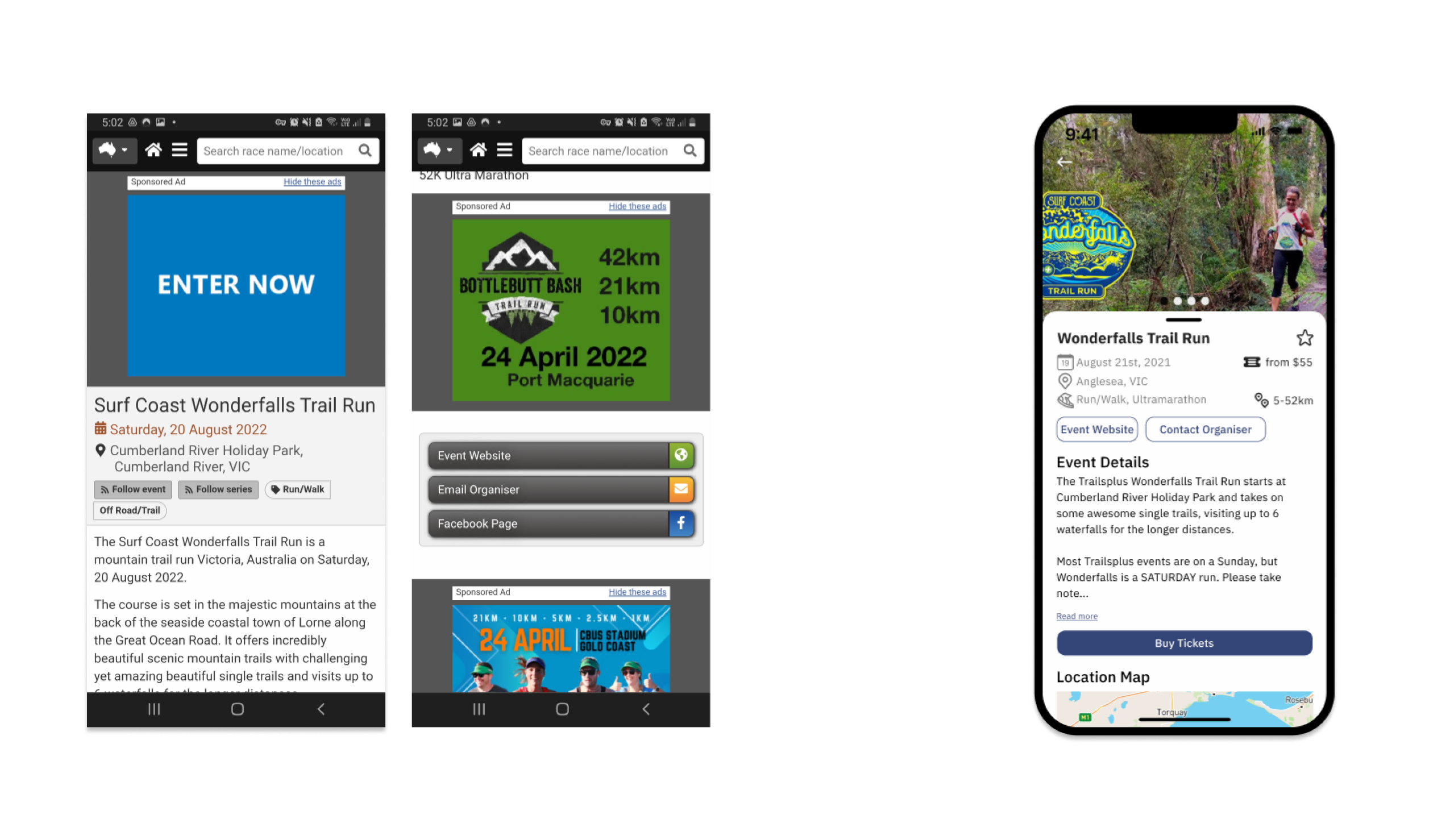
Ads are now cards that blend into the user’s experience instead of ‘looking too ad like’ and interrupting the user’s flow and experience.
I can’t stress enough the importance of understanding design principles after having gone through
this sprint.
Gestalt, Jakobs and other principles such as how to utilise of colours, sizes and styles to add
hierarchy to the Interface and guide the user to a desired action is due mostly to these
principles. A make or break for a design.
At any moment of any sprint, a designer (and others) should be taking decisions based on what will be better for the user. Nothing else. As Steve Jobs once said in a 1997 Apple event:
